Commercial Work
KNEES - Short film poster art


Commissioned poster design for 'KNEES' the short film following 5 siblings clearing out the house after the tragic passing of their parents. The direction for this began very loosely, wanting to focus on the house and ideas of space and emptiness to capture the essence of the film.
The poster for this film wanted to capture an analogue feel and aimed for a 'scrapbook' overall aesthetic to capture the atmosphere projected within the piece.
As the project developed input from the producer meant there was a distinct pivot in direction to have the actors as more of a focal point for promotional purposes. The end result aims to marry the original essence of 'Knees' whilst remaining as a promotional material.


Adhering to AGE UK’s brand guidelines,
we have utilized the FS ME font to craft
the re.mark logo. This choice not only
aligns with the established brand
identity but also serves as a foundation
for our creative exploration.
By distorting, reworking, and reimagining
the pre-existing typeface, we pay homage
to both the charity and the innovative nature
of re.mark’s work.
The application of a hazy halftone effect over
the typeface evokes a sentimental reference
to print media, symbolizing the reuse of the old
in a modern context. This design element
bridges the past and present, aligning with
re.mark’s ethos of regeneration and sustainability.
Incorporating recognizable symbols such as the
fast forward and rewind icons the logo evokes a
comforting sense of nostalgia through familiar
shapes. These symbols represent the brand’s mission
to bring previous generational ideals into contemporary
relevance. The encompassing circle further reinforces
re.mark’s cyclical and regenerative values, creating a
cohesive and meaningful visual identity.
re.mark marks the rebrand of this project previous known as The Upcycled Collection

THE UPCYCLED COLLECTION


NAILS BY MAISIE

The UPCYCLED COLLECTION
Project Overview:
The UPCYCLED COLLECTION served as the previous branding for re.mark, developed during a transitional period aimed at fostering experimental and innovative design. The core concept was to use collage as a transformational medium, creating logos and custom typefaces that reflect the brand's values of reuse and re-creation.
Design Elements:
Collage as a Medium: Logos were designed using collage techniques to embody the principles of re-use and re-creation, integral to the brand's philosophy.
Custom Typefaces: A variety of custom typefaces were explored to convey diverse brand identities, ensuring each design was unique and reflective of the brand's innovative spirit.
Transitional Visual Identity: The concept included a dynamic visual identity that could evolve with each season, allowing for continual renewal and adaptation.
Implementation:
The UPCYCLED COLLECTION's design ethos was implemented across all brand touchpoints, including logos and other branding materials. This approach not only highlighted the brand's commitment to sustainability but also ensured a fresh and engaging visual presence that could adapt to changing trends and seasons.

Project Overview:
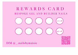
The client, Nails by Maisie, sought a branding and visual identity that exudes classic elegance and timelessness. To achieve this, I hand-designed a custom typeface inspired by the Art Nouveau illustrative era, an aesthetic that particularly resonated with the client.
Design Elements:
Custom Typeface: A bespoke typeface was created, drawing inspiration from the intricate and elegant letterforms characteristic of the Art Nouveau period.
Logo Design: The logo was crafted using the client’s initials, M.W., to form a distinctive and personal brand mark.
Color Palette: A modern twist was added through the use of various shades of pink, maintaining a contemporary and feminine look.
Implementation:
Brand Identity: The cohesive aesthetic was applied across all brand touchpoints, including social media profiles and loyalty cards, ensuring a consistent and recognizable brand presence.
The result is a visually striking and cohesive brand identity that encapsulates the client’s vision of classic elegance with a modern, feminine touch.

IN FOCUS Arts Festival with Blaze Arts
In Focus Festival – Logo & Visual Identity
Project Overview:
Commissioned to create a visual identity for In Focus Festival (orignially named Happy Place Festival) a youth led arts festival, the design process began with playful explorations of moods and ideas of sunshine and positivity.These initial concepts led to more character-driven logos, embodying the festival’s emphasis on creativity and community.
Design Development:
As the project evolved, the focus shifted to a more grounded visual language. Inspiration was drawn directly from a structure designed by a local youth group, incorporating their work as the foundation for the logo. This created a strong link between the festival’s identity and the community it serves, ensuring the design felt both authentic and participatory.
Implementation:
The resulting logo and design system balance youthful energy with a sense of cohesion, reflecting the festival’s mission to celebrate creativity while foregrounding the voices of young people at its core.


